


Typography Tips for Web Designers
Typography is the unsung hero of web design, influencing the way users absorb information and interact with your site. As a web designer, understanding the principles of typography is crucial for creating a visually appealing and user-friendly online experience. In this guide, we’ll explore key tips to help you master the art of web typography […]
-
Asifur Rahman
-
13 Mar 2026
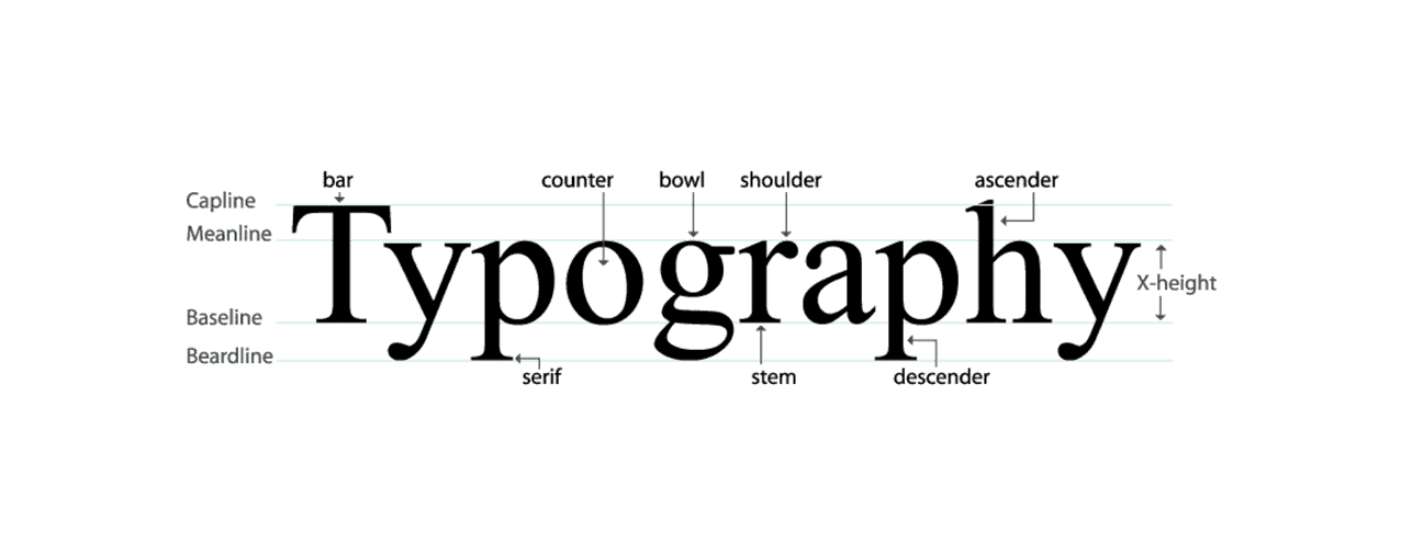
Typography is the unsung hero of web design, influencing the way users absorb information and interact with your site. As a web designer, understanding the principles of typography is crucial for creating a visually appealing and user-friendly online experience. In this guide, we’ll explore key tips to help you master the art of web typography and elevate the overall design of your website.
- Prioritize Readability:
- Choose Appropriate Font Styles: Opt for clear and legible font styles. Sans-serif fonts like Arial or Helvetica are commonly preferred for online content due to their simplicity and readability.
- Mindful Font Size and Line Spacing:
- Responsive Font Sizes: Ensure font sizes are responsive, adapting to various screen sizes. Balance text density by incorporating sufficient line spacing (line height) for optimal readability.
- Hierarchy and Consistency:
- Establish a Visual Hierarchy: Use font sizes, weights, and styles to create a clear visual hierarchy. Headings should be larger and bolder than body text, guiding users through the content effortlessly.
- Limit Font Choices:
- Two-Font Rule: Stick to a maximum of two or three fonts for a clean and cohesive look. Consistency in font choices across your website contributes to a more professional appearance.
- Consider Brand Identity:
- Reflect Brand Personality: Choose fonts that align with your brand identity. For example, a tech-oriented brand might opt for a modern, sleek font, while a vintage-inspired brand might prefer a more classic typeface.
- Responsive Typography for Mobile:
- Adapt for Mobile Devices: Ensure your typography adapts gracefully to different screen sizes. Test your font choices on various devices to guarantee readability and visual appeal across the board.
- Contrast for Emphasis:
- Play with Font Weights: Utilize font weights to create contrast and emphasize key points. Bold or italicize important information to guide the user’s attention.
- Whitespace as a Design Element:
- Embrace Whitespace: Adequate whitespace around text elements enhances readability and gives a clean, organized appearance. Whitespace is a powerful design element that can contribute to a sophisticated and modern look.
- Legibility in Color Choices:
- Ensure Contrast with Background: Opt for high contrast between text and background colors to maximize legibility. Accessibility is key, and search engines value websites that prioritize user-friendly design.
- Test Across Browsers and Devices:
- Cross-Browser Compatibility: Test your chosen fonts on various browsers to ensure consistent rendering. This helps maintain a uniform user experience regardless of the browser or device used.
Conclusion:
Mastering web typography is a journey that involves a deep understanding of design principles, user experience, and brand identity. By prioritizing readability, establishing hierarchy, and maintaining consistency, web designers can create visually stunning and effective websites that leave a lasting impression on users. Remember, typography is not just about choosing fonts; it’s about crafting an immersive reading experience that complements your overall design vision.

Comments ( 0 )